Data Visualisation with Power BI | Final Quiz
Quiz Summary
0 of 7 Questions completed
Questions:
Information
You have already completed the quiz before. Hence you can not start it again.
Quiz is loading…
You must sign in or sign up to start the quiz.
You must first complete the following:
Results
Results
0 of 7 Questions answered correctly
Your time:
Time has elapsed
You have reached 0 of 0 point(s), (0)
Earned Point(s): 0 of 0, (0)
0 Essay(s) Pending (Possible Point(s): 0)
Categories
- Not categorized 0%
- 1
- 2
- 3
- 4
- 5
- 6
- 7
- Current
- Review
- Answered
- Correct
- Incorrect
-
Question 1 of 7
1. Question
How should you interpret the correlation coefficient of 0.87 between the variables of height and weight?
CorrectIncorrect -
Question 2 of 7
2. Question
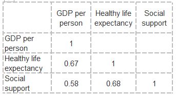
Which of the below statements are correct interpretations of the below correlation plot?
 CorrectIncorrect
 -
Question 3 of 7
3. Question
Using the below dataset showing course enrolments
Course enrollments
Male Female Total 21 37 58 Match the correct calculations against the statements
Sort elements
- 36.21%
- 63.79%
- 76.19%
- 27.58%
-
The percentage of total enrolments which are Male
-
The percentage of total enrolments which are Female
-
There are X percentage more females enrolments than male enrolments
-
Against total enrolments, female enrolments represent X more percentage points male enrolments
CorrectIncorrect -
Question 4 of 7
4. Question
Match the configuration you would need to create a bubble plot in PowerBI where:
- The size of the bubbles are related to the goal amount and:
- The bubbles are coloured according to the main_category
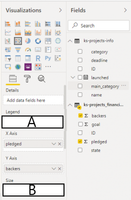
Sort elements
- main-category
- goal
- ID
-
A
-
B
-
unused
CorrectIncorrect -
Question 5 of 7
5. Question
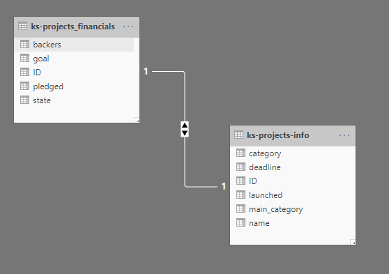
What is this data model displaying?
CorrectIncorrect -
Question 6 of 7
6. Question
Select common examples where statistics/ visualisations are used in a misleading manner.
CorrectIncorrect -
Question 7 of 7
7. Question
Match the best choice of visualisation to the purpose
Sort elements
- Line graph
- Bar or column graph
- Clustered column or stacked column graph
- Scatter plot
- Bubble plot
-
Plotting data over time
-
Comparing categorical variables
-
Comparing multiple dependant variables against one independent variable
-
Displaying the relationship between two variables
-
Displaying the relationship between three variables
CorrectIncorrect