Formative Assessment – Avocados
Quiz Summary
0 of 17 Questions completed
Questions:
Information
You have already completed the quiz before. Hence you can not start it again.
Quiz is loading…
You must sign in or sign up to start the quiz.
You must first complete the following:
Results
Results
Time has elapsed
Categories
- Not categorized 0%
- 1
- 2
- 3
- 4
- 5
- 6
- 7
- 8
- 9
- 10
- 11
- 12
- 13
- 14
- 15
- 16
- 17
- Current
- Review
- Answered
- Correct
- Incorrect
-
Question 1 of 17
1. Question
Welcome to this formative, or practice, assessment.
Aim: The purpose of this lesson is to help you prepare for the summative assessment in a similar environment.
Method: We’ll go through the 4 step Data Analysis method (Define > Transform > Analyse > Communicate) with the given scenario. During this assessment, you’ll be presented with various questions or problems that you should attempt on your own. The answer will then be presented on the next page, with a step-by-step walkthrough (with screenshots or gifs).
Materials: You’ll require the assessment workbook and additional data:
These are also found in the ‘Materials’ tab.
Scenario:
You are a data analyst at a company that supplies Hass avocados to farmers markets within the US.
The data you have been provided is from the Hass Avocado Board, which provides the weekly average prices of Hass avocados by city or region and over time.
The managers want to know how they can use this data to improve profitability.
CorrectIncorrect -
Question 2 of 17
2. Question
Define
There are 3 things we want to do within the define stage:
- First, we need to frame our given problem into data terms, which will form the basis of our analysis.
- Once we’ve done this, we need to check what data is available. What is it’s range and scope? You might need to refine your question based on the available data.
- Lastly, once we have an understanding of our dataset, we should write down some questions for targeted analysis, and some notes on how to display our findings.
Note: you will come back to (and sometimes refine) these questions at all stages of your process.
With the scenario provided in mind, how could we frame our scenario and given problem in data terms? Select the answer that best fits the given scenario
Make sure to note this into your Workbook under the ‘Define’ tab.
CorrectIncorrect -
Question 3 of 17
3. Question
To frame our given problem in data terms, we could ask:
- What metrics affect the price of avocados?
Great, so we need to look at what affect the different metrics (such as region and time of year) have on the average price.
Next, let’s take a look at the scope of our data. Download both the workbook and the 3 csv files in the materials tab. Each file represents a year of data. How would you combine this data to your workbook?
CorrectIncorrect -
Question 4 of 17
4. Question
While you could manually copy and paste the data in, or open each csv in excel and move the tabs across to your main worksheet, the easiest way is to use Excel Power Query to append the data together.
Note, if you’re using a Mac, you won’t have access to Excel Power Query – you’ll need to load the csvs in manually (just copy & paste the rows of data into your main workbook)
While you could load each file individually a better option is to import the files all at once.
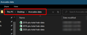
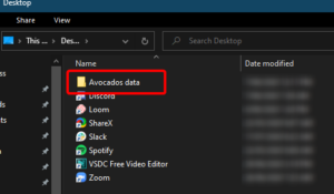
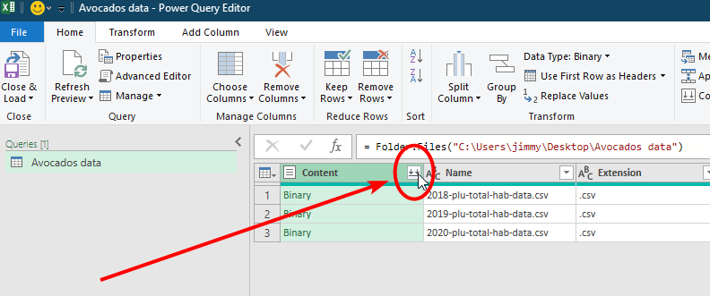
First, make sure your files are all in one folder. In the screenshots below, you can see I’ve created a folder on my desktop (called ‘Avocados data’) with the csv files within.
Next, in your excel workbook (Formative Assessment – Avocados) go to the Data Tab > Get Data > From File > From Folder
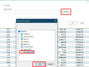
Next, choose the folder path – click on browse and choose your folder. In the example below, our folder is on our desktop – select and click OK.
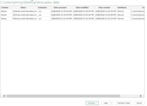
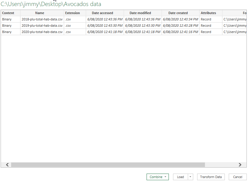
You’ll be presented with this screen where you can combine the files together – click on the combine button and select ‘Transform Data’
You’ll then be within Power Query. Click on the double down arrow to expand these files. Excel will evaluate the query and combine them – click ‘OK’ on the next screen.

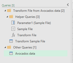
On the right-hand side you’ll see a number of new queries, including some sample and transform files, but the query we need is simply ‘Avocados data’, which contains all 3 files within the single query.
Let’s close and load this data to our workbook on a new worksheet. Click on ‘Close & Load’, then rename the new sheet ‘data’.
CorrectIncorrectHint
While you could load each file individually a better option is to import the files all at once.
First, make sure your files are all in one folder. In the screenshots below, you can see I’ve created a folder on my desktop (called ‘Avocados data’) with the csv files within.
Next, in your excel workbook (Formative Assessment – Avocados) go to the Data Tab > Get Data > From File > From Folder
Next, choose the folder path – click on browse and choose your folder. In the example below, our folder is on our desktop – select and click OK.
You’ll be presented with this screen where you can combine the files together – click on the combine button and select ‘Transform Data’
You’ll then be within Power Query. Click on the double down arrow to expand these files. Excel will evaluate the query and combine them – click ‘OK’ on the next screen.
On the right-hand side you’ll see a number of new queries, including some sample and transform files, but the query we need is simply ‘Avocados data’, which contains all 3 files within the single query.
Let’s close and load this data to our workbook on a new worksheet. Click on ‘Close & Load’, then rename the new sheet ‘data’.
-
Question 5 of 17
5. Question
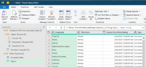
Once you’ve loaded the data from the 3 csv files (2018-2020), then next step is to append the existing 2017 data to this table. Click back into the sheet ‘2017’ and click into any cell. In the Data Tab, under ‘Get & Transform Data’, click on ‘From Table/Range’ to load this table to Power Query.
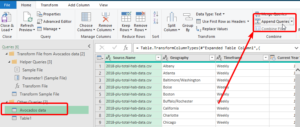
We now have 2 queries under ‘Other Queries’ – ‘Avocados data’ and ‘Table 1’ as shown below.
Highlight ‘Avocados data’ in the queries on the left-hand side, then click on ‘Append Queries’ to add these together.
Note: ‘Append’ is for adding new rows of data to your table, whereas ‘merge queries’ is for joining additional columns of data onto your table.
In the dialogue box that appears, have ‘Two Tables’ selected, and choose ‘Table1’ from the dropdown, then click OK.
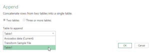
Note: You could instead have ‘Table 1’ highlighted and have ‘Avocados data’ as the appended table – either way works!
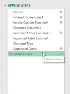
You’ll see this step has been added on the right-hand side in ‘Applied Steps’. Click close & load to add this to our workbook.
Finally, click on the chevron on the ‘Current Year Week Ending’ column in our ‘data’ sheet. You can see we now have data from 2017 – 2020. Well done!
 CorrectIncorrect
 -
Question 6 of 17
6. Question
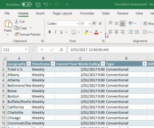
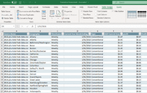
Now that we have all our data in the one workbook, let’s take a look at the scope of our data. Open the ‘Data Dictionary’ sheet in the workbook.
What does each row of data represent?
CorrectIncorrect -
Question 7 of 17
7. Question
When does the data begin? When does it end? (as per the ‘Current Year Week Ending’ field)
CorrectIncorrect -
Question 8 of 17
8. Question
Checking the data, I can see that each row of data represents a single week of sales per city. We have ‘ASP Current Year’, which is the average sales price for that week and city. This is going to be the most important metric, as we can compare this value across different cities and time of year.
Note: The ‘Geography’ column includes cities and regions, which is a summary of the cities within the region. We’ll filter these out during our transformation steps.
Our questions for targeted analysis then might look like:
- Which cities have the highest ASP?
- How has this changed over the years?
- Which quarters, seasons or months have the highest ASP?
Note that we are less concerned with the amounts of avocados sold, and more concerned with the average price per avocado. Make sure to note these questions within your workbook (under the ‘Define’ sheet); we’ll refer back to these at different stages of the process.
Other questions we could ask this dataset include:
- How does organic vs conventional compare in terms of ASP?
- Which regions have the highest number of units?
- Which regions purchase bags rather than individual avocados?
However, it’s important to focus our questions on the most important metrics. Data analysis is as much about what you leave out as what you include.
CorrectIncorrect -
Question 9 of 17
9. Question
Now that we have all our data in the one table, we’re comfortable with our dataset and we have an idea of what questions to ask our data, let’s dive a little deeper into our dataset and see what steps we might need to take to clean our dataset.
First, ‘Geography’ includes ‘Total US’ and Regions summaries, as well as cities. This will skew our analysis, so let’s filter out anything that isn’t a city within Excel Power Query.
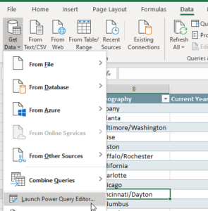
Go into the Data tab > Get Data > Launch Power Query Editor.
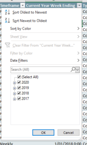
Click on the chevron on ‘Geography’ column, and untick the following:
- Grand Rapids
- Great Lakes
- Midsouth
- Northeast
- Northern New England
- Plains
- South Central
- Southeast
- Total U.S.
- West
You’ll now see another step added in the right-hand side in your ‘Applied Steps’. Right-click on this step, and rename it to ‘Filtered out regions’ for better tracking of your transformation steps.
Now that we’ve removed all the regions, and this column now only contains Cities, we can rename this column to ‘City’ for ease of use.
There are a number of formatting steps we can take to tidy up, such as:
- Change ASP column to currency, and normalise the heading to ‘ASP’ (Average Sales Price)
- ‘Current Year Week Ending’ to a short date
- Hide column C (Timeframe)
- Tidy up any other of the column headings you like
Note: you can do these steps in either power query or directly in Excel, remember to be descriptive in your cleaning/transformation steps either way
Feel free to do more if you desire, remembering to update the data dictionary.
CorrectIncorrect -
Question 10 of 17
10. Question
We’ve now defined our problem in data terms and cleaned up our dataset. Let’s begin with some exploratory analysis using PivotTables.
Exploratory analysis is a good way to: (select all that apply)
CorrectIncorrect -
Question 11 of 17
11. Question
Let’s look at the first question in our targeted analysis:
- Which cities have the highest ASP?
- How has this changed over the years?
To answer the first question, create a pivot table and chart to show:
- Top 10 cities by highest average ASP
Have a go at creating this now, and we’ll go through it step by step on the next page.
CorrectIncorrect -
Question 12 of 17
12. Question
Let’s create our first PivotTable.
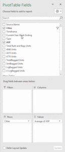
With any cell on your data sheet selected, go to the Table Design tab > Summarize with PivotTable.
Now we have our PivotTable in a new sheet (Sheet1).
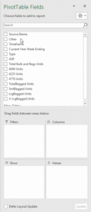
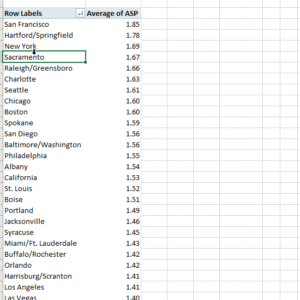
In PivotTable fields on the right-hand side, drag and drop ‘Cities’ into Rows and ‘ASP’ into Values.
By default, the Values have aggregated into a Sum. Change this to an Average by right-clicking on one of the values in the PivotTable > Summarise Values By > Average.
Next, we’ll sort largest to smallest, by again right-clicking on one of the values and selecting Sort > Largest to smallest.
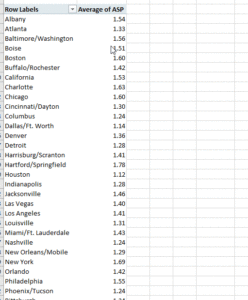
Lastly, we’ll filter on the rows to only show the top 10.
Right-click on one of the cells under ‘Row Labels’, then select ‘Filter…’ > Top 10, and hit ok.
Now that we have our PivotTable with the top 10 cities, create a PivotChart.
With the PivotTable selected (any cell inside will do), click into the Insert tab > Recommended Charts. Click OK.
Shortcut: press Alt+F1 on your keyboard to insert a recommended chart
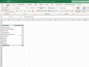
We now have our first chart! However,
What could be misleading about this chart?
CorrectIncorrect -
Question 13 of 17
13. Question
The Y-Axis doesn’t begin at 0, which could be misleading. Remember to always start your Y-Axis at 0, unless there’s a good reason (in which you should mention it in your chart comments)
Let’s optimise this chart by:
- Giving it a descriptive title
- Update the Y-Axis to begin a 0
- Deleting the legend
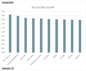
While we now have a visualisation of the top 10 states by ASP, it’s a little bland. Let’s update this to answer another question, Has this changed over the years?, by bringing in the ‘Week ending’ field into the Columns.
You’ll notice excel has automatically put the date into a hierarchy of Years > Quarters > Week ending. We’ll talk about this in a second.
Let’s put ‘Legend’ back into our graph by selecting the graph, clicking on the (+) button next to it to add a chart element, then selecting ‘Legend’.
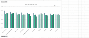
We now have Years, Quarters, and Week Ending that we can filter on. For this graph, let’s make it a bit cleaner by removing the Quarters and Week ending from the Legend (Series). You can just drag and drop these fields outside of the areas.
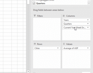
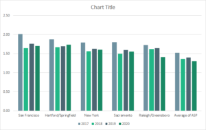
Finally, update the title to ‘Top 10 Cities by ASP over time’.
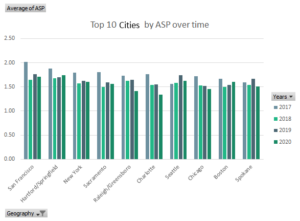
Congratulations, we now have a graph which shows the top 10 (most expensive) cities for avocados!
CorrectIncorrect -
Question 14 of 17
14. Question
Let’s take a look at displaying this visualisation in a different way, by switching around the Legend and the Axis (Columns and Rows).
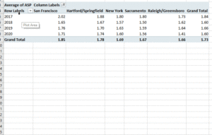
Clicking back into the PivotTable, click and drag Cities into Columns and Years into Rows.
You now have a graph looking something like this:
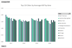
The value in this graph is you can click on the ‘Cities’ dropdown, and update your value filters to instead show less, or more, of the top cities.
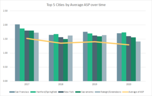
For example, this graph shows the top 5 cities, which is a lot neater.
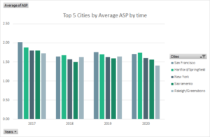
We can see from this visualisation that the average price of avocados over time seems to be trending down (hooray!). What could be useful is additionally showing the average per year across all of the values in cities against this graph.
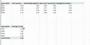
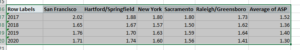
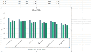
We can do this via a combo chart. First, copy and paste part of the pivot table as shown below:
Note: we don’t want the ‘Grand Total’ here, as that is only an average across those 5 values, not the entire dataset
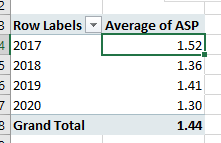
Next, let’s figure out the average per year. The quickest way to do this would be to copy the pivot table we’ve created, then remove ‘Cities’ from the columns area. This will leave us with the average per year. (Alternatively, create a new PivotTable with ‘Years’ in the rows and ASP in the Values, & summarise values as Average)
Note: don’t change the original PivotTable, as this would also change the chart (they’re linked)
Next, copy and paste these values (Average of ASP per year) onto the right of our new data table.
Great, we have our table of data, now let’s visualise it. Highlight the data like so:
Then in the insert tab, click ‘Recommended Charts’ (or Alt+F1). You should have a graph like so:
>
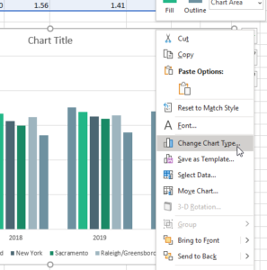
However, we want the years as the axis and the cities as the series. Select the cities and then right-click > select data > Switch Row/Column
Alternatively, in the ‘Chart Design’ tab (note: this tab is only available when a chart is selected), click on the ‘Switch Row/Column’ button.
CorrectIncorrect -
Question 15 of 17
15. Question
Next, let’s change the Average of ASP from a column to a line by making this a combo graph. Right-click on the graph and select ‘Change Chart Type’
Select ‘Combo’ down the bottom, then have all the cities as ‘Clustered column’ and the Average of ASP as ‘Line’. Click OK.
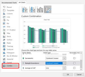
Awesome. We now have the top 5 most expensive cities with an average line. You can make the line ‘pop’ a bit more by selecting it, then right-clicking and selecting ‘Format Data Series…’
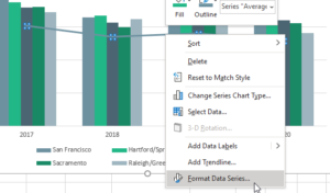
In this pane on the right hand side, click onto the paint bucket to change the formatting of this line. Update the colour and width.
Finally, give the chart a title. It should look a little like below. Well done!
 CorrectIncorrect
 -
Question 16 of 17
16. Question
Let’s answer the other question identified in our define stage,
- Which quarters, seasons or months have the highest ASP?
Let’s look at quarters first.
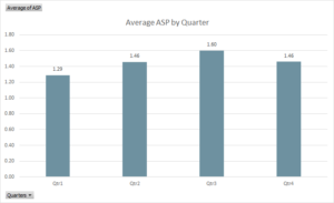
Create a new PivotTable with ‘Quarters’ in the rows and ‘ASP’ in the Values. Again, summarise by average. Create a chart of this and add data labels and a title. From this visualisation, we can see that the highest prices for avocados are in the 3rd Quarter of the year.
Let’s add years to this visualisation by bringing the ‘Years’ field into Columns in our PivotTable. Your pivot chart should look a little like this:
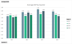
From here, we can see there was a sharp increase in price from Q1 > Q3 (and a significant dropoff) for years 2017 and 2019, whereas 2018 had a much smaller difference between the quarters (with a range of only 11 cents – between $1.31 and $1.42).
Note that 2020 only has data for the first two quarters, but based on previous data we could predict that prices will rise in the 3rd quarter and then drop off in the 4th quarter.
CorrectIncorrect -
Question 17 of 17
17. Question
Next let’s take a look by month.
Create a new pivot table (or copy and paste one of your previous) and have ‘Current Year Week Ending’ in the Rows / Axis (Categories) section and Average of ASP in Values.
We’ve used column charts mostly, so let’s have a bit of a change and use an area chart.
Note: Area and line charts are useful for showing values over time
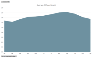
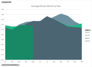
We could add the years into this chart by bringing the field into the Columns / Legend (Series) section which gives us a lovely little mountain range like so:
Finally, we could then iterate on this visualisation by adding the global average as a line:
Note: copy and paste your data from the pivot table(s) to create another reference table for your graph
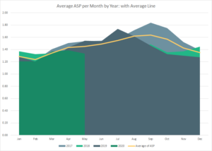
Which leaves us with a gorgeous looking visualisation, an answer to our question: Which months have the highest ASP?
Analysing this visualisation in context, we can see that while Q3 had a sharp increase in prices from Q2, in 2019 the peak came during July whereas in 2017 the peak was in September.
We’ve now answered the two core questions we identified during our Define stage. There’s plenty more we could do with this data, but this is a great start.
If you like, continue to analyse this dataset on your own.
When you’re ready, take the final summative assessment!
CorrectIncorrect