Formative Assessment – Craft Beer
Quiz Summary
0 of 25 Questions completed
Questions:
Information
You have already completed the quiz before. Hence you can not start it again.
Quiz is loading…
You must sign in or sign up to start the quiz.
You must first complete the following:
Results
Results
0 of 25 Questions answered correctly
Your time:
Time has elapsed
You have reached 0 of 0 point(s), (0)
Earned Point(s): 0 of 0, (0)
0 Essay(s) Pending (Possible Point(s): 0)
Categories
- Not categorized 0%
- 1
- 2
- 3
- 4
- 5
- 6
- 7
- 8
- 9
- 10
- 11
- 12
- 13
- 14
- 15
- 16
- 17
- 18
- 19
- 20
- 21
- 22
- 23
- 24
- 25
- Current
- Review
- Answered
- Correct
- Incorrect
-
Question 1 of 25
1. Question
Welcome to this formative, or practice, assessment.
Aim: The purpose of this lesson is to help you prepare for the summative assessment in a similar environment.
Method:
In this formative assessment, you’ll put into practice the skills you’ve learnt within the Data Visualisation with Power BI course.
During this assessment, you’ll be presented with various questions or problems that you should attempt on your own. The answer will then be presented on the next page, with a step-by-step walkthrough (with screenshots or gifs).
Materials: You’ll require the two datasets below:
These are also found in the ‘Materials’ tab.
Scenario:
You are a data analyst at a craft beer company. The company wants to check trends in craft beer & analyse what styles are popular in order to decide what products to produce. They require this data in the form of an interactive dashboard, and it’s up to you to deliver it!
Terminology:
Using this dataset and scenario you’ll be introduced to the wonderful world of craft beer. If you’re a craft beer fan (like myself) you’ll likely be already familiar with the below terms.
ABV: Alcohol by volume. What alcoholic percentage is the beer? Beers usually fall between the 4-6% mark, with some styles (such as IPA) being (on average) higher in ABV.
IBU: International Bittering Units. How bitter is the beer? Styles such as lagers or wheat beers will generally be low in IBU, whereas styles such as IPA (India Pale Ale) will be more bitter.
Style: Beers come in a variety of different styles! They range from simple light-coloured lagers to dark-coloured stouts and porters.
Ounces: As this is an American dataset their beer is measured in ounces. If you like, you can change this with a calculated column later on.
More details on beer measurement can be found at the link below:
https://en.wikipedia.org/wiki/Beer_measurement
Take a quick look at the assessment workbook and scenario provided, then click into the quiz to begin!
CorrectIncorrect -
Question 2 of 25
2. Question
Firstly let’s load our data into Power BI. Open Power BI Desktop and click ‘Get Data’.
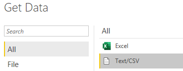
Select ‘Text/csv’ then ‘Connect’.
Note: If you move, delete, rename or otherwise change your data it will cause issues to your Power BI file. Avoid this at all costs – I recommend having a folder that you don’t touch with these datasets within.
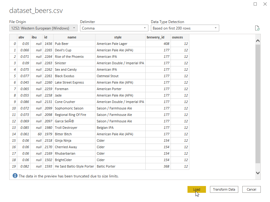
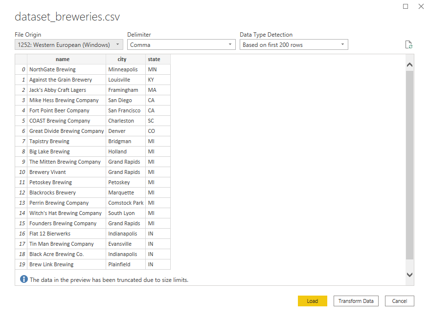
Load the first dataset, dataset_beers.csv, into Power BI.
Take a look at the column headings and think about the data we have per row & what metrics we might be able to use to analyse our data.
At this stage, it would be best practice to explore the data, it’s limitations and creates a data dictionary. If you’d like the practice, create a data dictionary for this dataset within Excel, or a Word or Google doc, & I’ll take you through the one I’ve created on the next page.
 CorrectIncorrect
 -
Question 3 of 25
3. Question
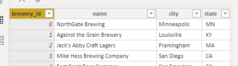
Each row is data on a single beer. Your data dictionary should look similar to the below:
Field Name
Type
Description
no column heading / column1
Number
Index number
abv
Number (between 0-1)
ABV (Alcohol by Volume) of the beer
ibu
Number
IBU (International Bittering Units) of the beer
ID
Number
Unique ID for the beer/row of data
Name
Text
Name of the beer
Style
Text
Style of the beer (101 distinct)
brewery_id
Number
ID of the brewery that brewed the beer – links to dataset_breweries.csv
ounces
Number
How many ounces is a can or bottle of the beer
In this dataset, which columns might we be able to measure? (by looking at descriptive statistics like count, average, % of total, etc). Select all that apply
CorrectIncorrect -
Question 4 of 25
4. Question
Great, so we could analyse most of these columns in different ways.
What are some of the questions for targeted analysis? (select all that apply).
Note: this is not covering off all of the questions, there are indeed many more we could look at – this is just to get us started
CorrectIncorrect -
Question 5 of 25
5. Question
Awesome, so generally we’ll be looking at measures of central tendency for ABV & IBU, per style, and how we can visualise this in an interactive dashboard.
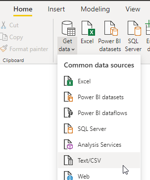
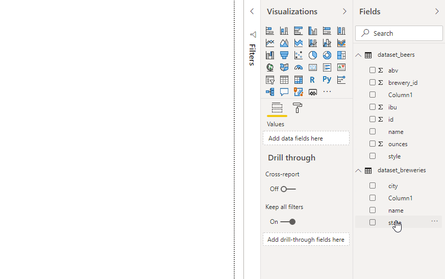
Next load in dataset_breweries.csv
(on the home tab > Get data > Text/CSV)
We can see that this dataset shows the locations of breweries within the US. What visualisations within Power BI represent an efficient way to visualise our measurable values against the locations in our dataset?
CorrectIncorrect -
Question 6 of 25
6. Question
Looking at our breweries dataset, which contains location data, we could visualise this on a map or filled map visualisation.
Once your data is loaded in, click and drag the “State” column from your fields list into the reports pane. This will create a Map visualisation.
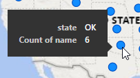
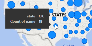
While this shows us the states that exist in the dataset, it’s not very useful at the moment (turns out all the states brew beer!). Let’s update our visualisation so the size of each bubble represents how many beers are brewed in each state.
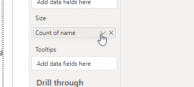
With your map visualisation highlighted, Click and drag “name” from the fields list into “Size”.
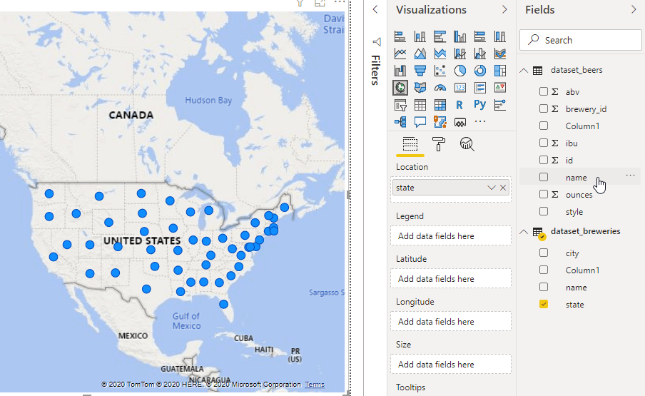
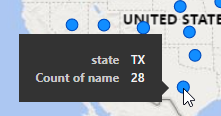
Hang on, something is not quite right. The size of our bubbles on the chart hasn’t changed at all, but if we hover over Texas (TX) for example, we can see that there’s a count of 28 – which should have a larger bubble than Oklahoma (OK) state (just above).
Let’s take a look at our data model. Click into the model tab
CorrectIncorrect -
Question 7 of 25
7. Question
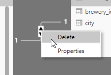
In our model, we can see a 1 to 1 relationship has been automatically created:
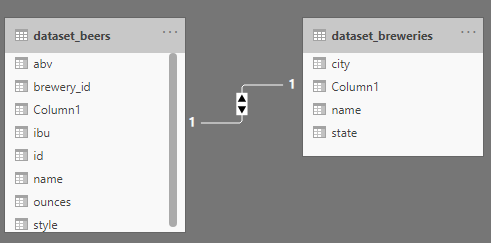
Hover over the relationship and what do you see. What could be the issue here?
CorrectIncorrect -
Question 8 of 25
8. Question
What should the relationship be?
Sort elements
- Many to 1
- brewery_id
- Column1
-
Type of relationship
-
Dataset_Beers
-
Dataset_breweries
CorrectIncorrect -
Question 9 of 25
9. Question
Within dataset_breweries the column1 should be renamed to “brewery_id” for consistency. Let’s update that first.
Click into the data tab on the left-hand side of Power BI.
Click into dataset_breweries on the right-hand side, then right-click on column1, and select Rename.
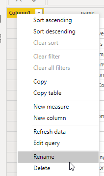
Directly type in “brewery_id” and press enter.
While we’re here, rename the other “column1” within the dataset_beers to “index”.
Once that’s done, let’s jump back into the model and let’s update the relationship. First, delete the current relationship by right-clicking and select “delete”.
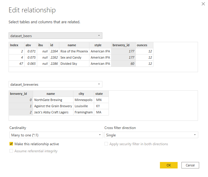
Then, create a new relationship by clicking and dragging brewery_id from dataset_beers onto brewery_id in dataset_breweries.
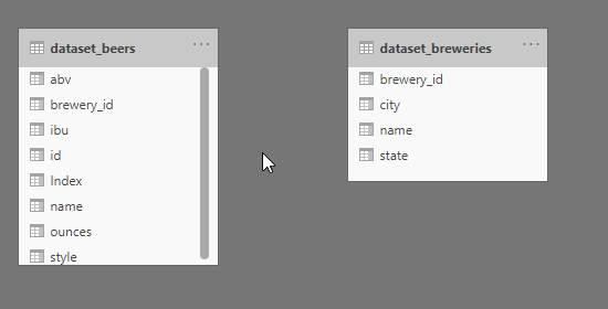
This has created a many to 1 relationship.
Each beer is created by a single brewery – and each brewery creates many beers. Hence, many to 1.
You can hover over the arrow to highlight which fields are linked, and you can right-click > properties to see further information on the relationship.
Check that ‘Make this relationship active’ is ticked.
 CorrectIncorrect
 -
Question 10 of 25
10. Question
Move back to the Reports tab, and we can now see that the size of the bubbles on our maps chart is correctly showing – where states that have brewed more beers have a larger bubble.
Instead of showing “Count of name”, however, let’s rename this to “Number of beers brewed”. You can do this by simply clicking on the chevron (dropdown arrow) and selecting “Rename”, then typing in directly.
Using this visualisation, where the size of the bubble indicates the number of beers brewed in that state, which state has the most number of beers brewed?
CorrectIncorrect -
Question 11 of 25
11. Question
Let’s take a look at the most popular style of beer.
On the same report page, create a bar chart: Count of Name by Style.
- Create a Bar chart by clicking on the visualisation
- Click and drag Name into Values, this should automatically aggregate to Count of Name.
- Click and drag Style into Axis
Which style has the most beers brewed?
CorrectIncorrect -
Question 12 of 25
12. Question
Use the same bar graph to answer the following question:
How many beers were produced of the 3rd most popular style?
Hint: You can hover over the bar for the tooltip
CorrectIncorrect -
Question 13 of 25
13. Question
Now that you’ve created this bar chart, you can use this as a slicer to interact with your map visualisation on the same page.
Scroll to the bottom of your bar chart, where “Wheat Beer” is at the bottom of the chart, & click on it. Which state produces the only Wheat Beer in this dataset?
CorrectIncorrect -
Question 14 of 25
14. Question
Let’s put in a couple of gauge visualisations to look at ABV and IBU, and see which styles are above or below the total average.
The gauge visualisation, if you haven’t used it before, is a good way to visualise:
- Tracking progress towards a milestone (such as a sales target)
- Visualising above or below a certain threshold (such as the total average of a particular metric when filters are applied).
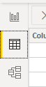
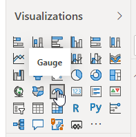
The Gauge is found here:
Click and drag ABV into the ‘Value’ section, then change it from the default SUM to average.
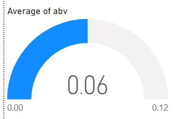
Great, but wouldn’t it be better if it displayed as a percentage? Let’s update that.
CorrectIncorrect -
Question 15 of 25
15. Question
Go into the Data tab, then click on the ABV field on the right-hand side. ABV will now be highlighted in yellow in your table.
On the Column tools tab click on the format dropdown and change it to ‘Percentage’ – refer to the gif below.
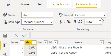
With this done we can click back into the report tab and see our gauge updated like so:
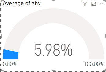
Awesome, but the maximum ABV isn’t going to be anywhere close to 100% – so let’s optimise our gauge.
CorrectIncorrect -
Question 16 of 25
16. Question
One way we could display this is by dragging ABV into the Maximum value section and changing it from the default SUM to a MAX. This will then show the average ABV per beer as the blue data (& the number in the middle) and the maximum value as the maximum value on the gauge.
Click on some different styles and see how the gauge updates – you can see how some averages are much closer to the max value.
Let’s add in a target value – again click and drag ABV, this time into the Target Value section, then click on the dropdown and change to Median.
Your gauge should look similar:
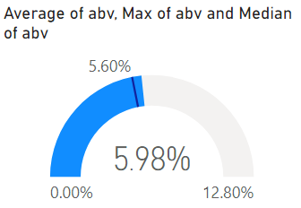
Now that we have both the median and the mean (average) plotted, this is a handy way to check the skew of the dataset. If there’s a large difference between the median and the mean, this could mean a skewed dataset.
CorrectIncorrect -
Question 17 of 25
17. Question
We’ve created one way of using a gauge, but for our final dashboard, we’d like to use the gauges to see when different styles are above or below the total average.
To achieve this, we’ll look at another way to set the maximum and target values. Delete this gauge visualisation, and create another to show average ABV – but this time, we’ll set the target line to the total ABV (across all styles), that way we can easily determine higher or lower ABV than the average when we slice our data.
Create a new gauge visualisation. Click and drag ABV into Values, then set this to Average of ABV.
Next, click into the format tab and click on the dropdown ‘Gauge Axis’. Set the target to 0.0598 (which is the average ABV) and the Maximum to 0.128 (which is the maximum ABV).
For the style, ‘American Pale Ale (APA)’, is the average ABV higher or lower than the total average? (use the gauge to determine).
CorrectIncorrect -
Question 18 of 25
18. Question
Create another gauge visualisation, this time for IBU. Complete the same steps as before, with the average value as the target and the maximum value as the maximum.
For the style, ‘American Pale Ale (APA)’, is the average IBU higher or lower than the total average? (use the gauge to determine).
CorrectIncorrect -
Question 19 of 25
19. Question
Rename this report tab to ‘Dashboard’, and create a new report tab by clicking on the (+) button.
Note: to rename a report tab, simply double click on the current name.
On this page we’ll take a look at another question:
- Is there a correlation between ABV and IBU?
Which visualisation can we use to plot the relationship between ABV and IBU?
CorrectIncorrect -
Question 20 of 25
20. Question
Great, we’ll use a scatter plot to visualise the relationship between the two variables, ABV and IBU.
Click and drag ABV into the X Axis, then use the dropdown to change it to Average. Do the same for IBU on the Y Axis, then bring Style into the Details section.
You should have something like this:
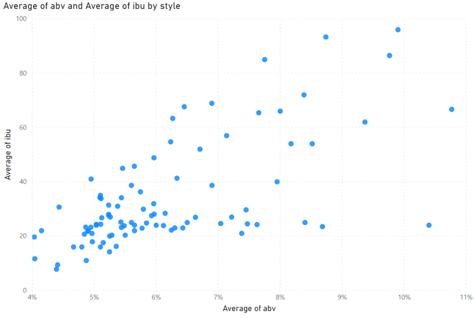
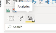
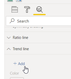
Let’s add a trendline to better visualise the relationship. With the scatter plot selected, click into the Analytics tab:
Click into the ‘Trend Line’ dropdown, then click ‘+ Add’.
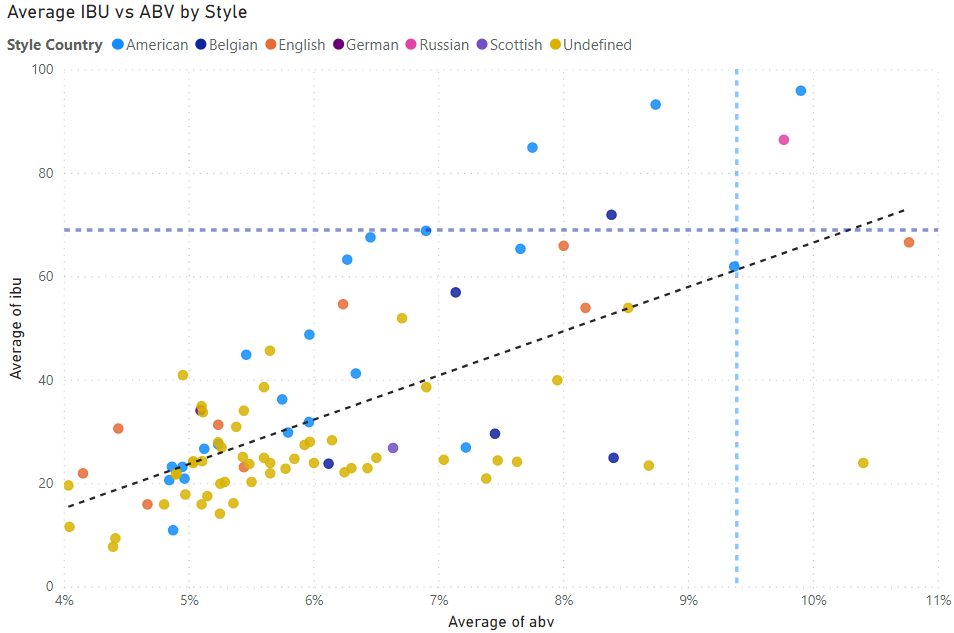
Great, with our trendline what can we determine about the relationship between ABV and IBU?
CorrectIncorrect -
Question 21 of 25
21. Question
There’s other lines we can include too, like Min, Max and Median values, or an X or Y axis constant line. Let’s look at adding a couple of percentile lines to see the beer styles that are highest in both ABV and IBU.
Scroll down to ‘Percentile line’ and click ‘+ Add’. Select the measure ‘Average of IBU’ and change the Percentile to 95%. Add another line for ‘Average of ABV’, with the same 95% percentile.
Which beer styles are above 95% in both ABV and IBU? (Average) Select all that apply
CorrectIncorrect -
Question 22 of 25
22. Question
There’s a large number of styles here, so let’s try and group some styles together. We’ll group beer styles from a particular country together – for example, let’s group American IPA, American Pale Ale, etc together under the banner ‘American’.
Jump into the data tab, and in the dataset_beers data create a new column and copy/paste the formula below. This is an IF statement that will assist with grouping.
StyleCountry = IF(CONTAINSSTRING(dataset_beers[style],”American”),”American”,IF(CONTAINSSTRING(dataset_beers[style],”English”),”English”,IF(CONTAINSSTRING(dataset_beers[style],”Russian”),”Russian”,IF(CONTAINSSTRING(dataset_beers[style],”Scottish”),”Scottish”,IF(CONTAINSSTRING(dataset_beers[style],”Belgian”),”Belgian”,IF(CONTAINSSTRING(dataset_beers[style],”German”),”German”,”Undefined”))))))
The formula above is pretty long, but essentially it’s a big IF statement – IF the style includes the word “American”, then it’ll be American. If it includes the word “English”, then it’s English. Etc etc – if it doesn’t include any of the specified words, then it will be Undefined.
With that done, click back into the reports tab and bring your new ‘StyleCountry’ field into the Legend section of your scatter plot.
This will group the styles into different colours based on this new field. Your visualisation should look a little like the below. Note I’ve updated the wording of the title and the legend.
 CorrectIncorrect
 -
Question 23 of 25
23. Question
Next, let’s plot the correlation coefficient of ABV vs IBU using an additional visualisation – we used this before in the Correlation lesson series.
If you don’t already have it, you can click on the ‘…’ in the bottom right-hand corner of the visualisations > Get more visuals.
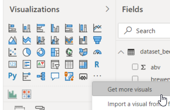
Then search for ‘correlation’, choose the correlation plot and ‘Add’.
You’ll then have the correlation plot visualisation imported. Select it to add it to our report.
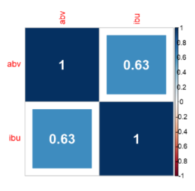
Next, click and drag both ABV and IBU to the ‘Values’ section. Based on this chart, we can see that ABV has a strong correlation with IBU (as we suspected!).
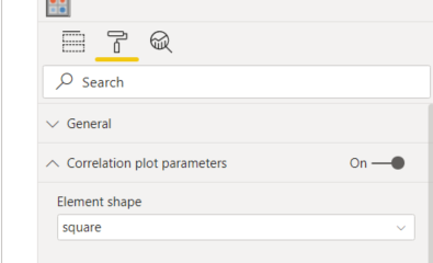
We can optimise this chart a little better though, so let’s jump into the format tab. First, under ‘Correlation plot parameters’, change the Element shape to Square.
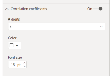
Next, turn on ‘Correlation coefficients’, change the # digits to 2, change the color to white, and bring the font size up to 16pt.
Your visualisation should now look similar to this:
 CorrectIncorrect
 -
Question 24 of 25
24. Question
Great, now we’ve plotted the correlation between ABV and IBU – and it’s fairly strong as the trendline indicated.
Lastly, let’s jump back into the dashboard where you have your map, bar chart and gauges.
Let’s update the style bar chart with our StyleCountry so we can drill down.
Click and drag StyleCountry into the Axis, above Style.
This will update the bar chart and you can now drill down using the downwards arrows or by right-clicking on any of the bars.
CorrectIncorrect -
Question 25 of 25
25. Question
As our last Visualisation, let’s create a histogram based on ABV. We’ll achieve this by creating a Group from our ABV field.
Click on the (…) on ABV, then choose ‘New Group’.
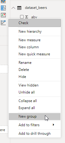
Leave the defaults for now, then click OK. You’ll now have a new field – abv (bins) which we can use.
Create a column chart with abv (bins) on the axis and Count of name as the Values. Change the title to: ABV Histogram.
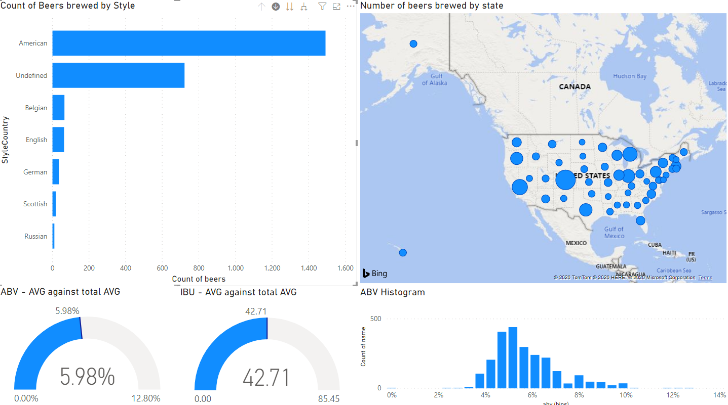
If you like, you can edit the group to resize your histogram’s classes. Play around with your dashboard first & choose some different styles to see the spread of values.
Do some final formatting by resisting some of your visualisations & tidying up some of the titles, and you should end up with a dashboard looking something like the below – well done!
 CorrectIncorrect